Cloudnine, Bangalore, India
Brand Establishment and Visual Language Design
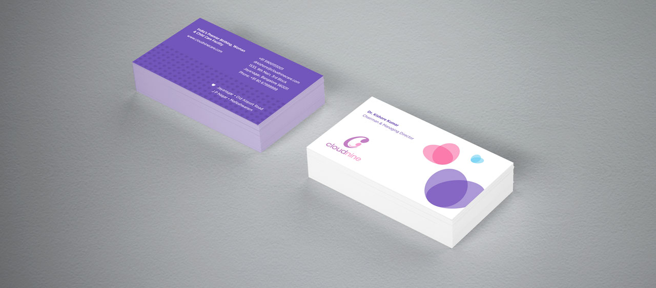
Cloudnine is a chain of premium birthing facilities in Bangalore, Hyderabad and Chennai. We were assigned the task to consolidate and establish the brand by fine-tuning and regularizing its already existing logo. At that time the Cloudnine logo could be seen in varying proportions and colour palettes. Kena team was instrumental in unifying the existing logo by clearly establishing, defining and specifying proportions of various elements of the logo, colour palettes and terms of use. These guidelines were meticulously explained in a Brand Manual designed by us.
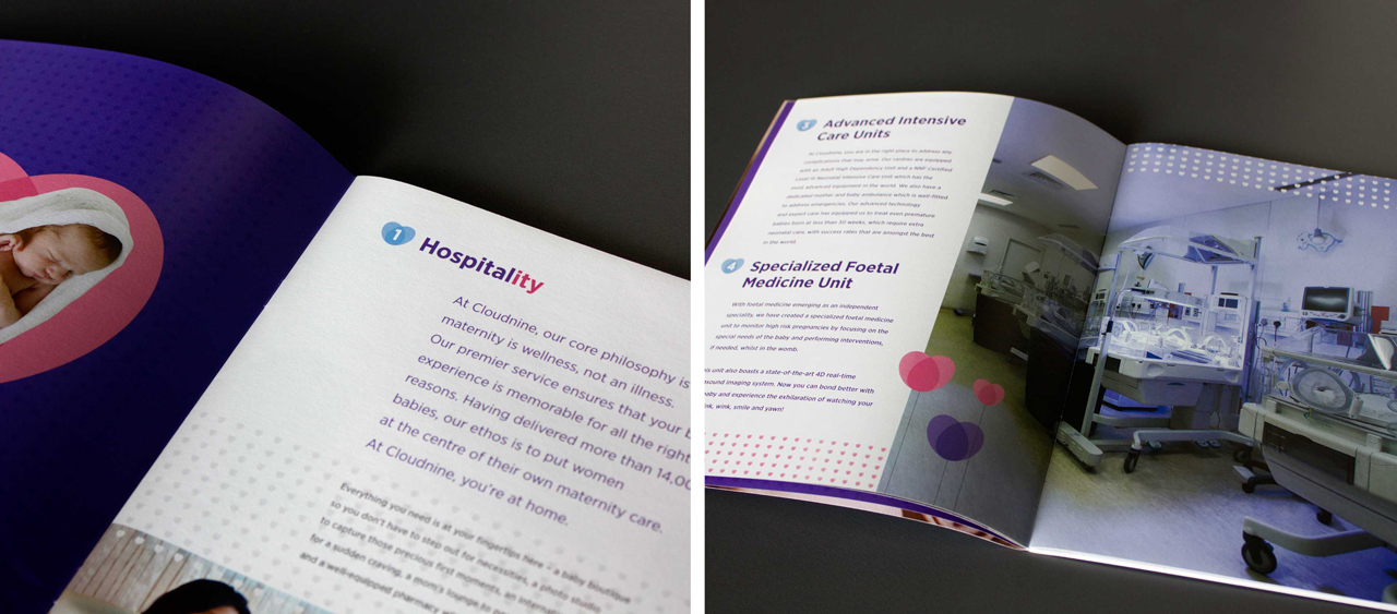
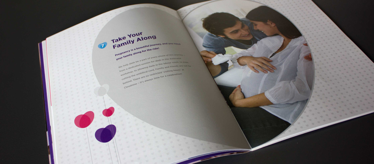
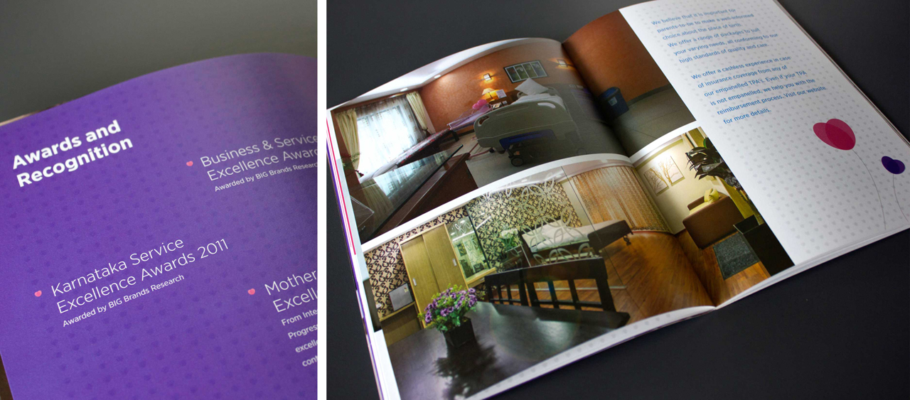
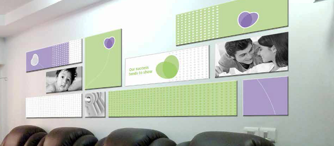
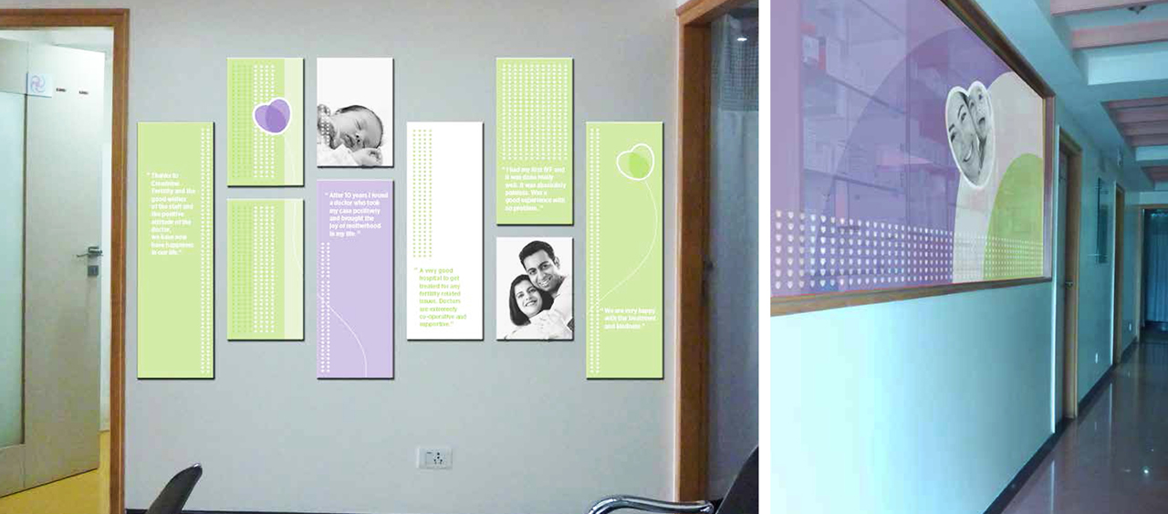
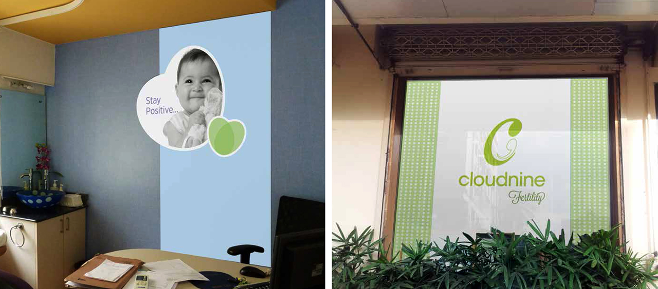
We also designed a completely new Visual Language that enhances the brand communication and brand recall value. The visual language uses the visual of a heart based on the same proportions as the logo. The visual of the heart is conceptualized so that it can be used in 4 different manners–heart, balloons, flowers, and as a background pattern. This Visual Language designed by us has been used effectively and consistently since then by the company’s ad agency in all their ad campaigns.
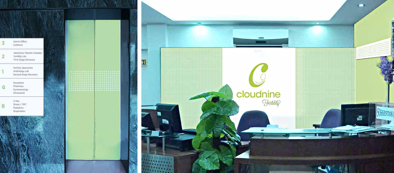
When Cloudnine acquired an already existing facility to open their Fertility clinic in Jayanagar, Kena was invited to spruce up the interiors through Environmental Graphics and signage design that engage and inform their customers.
#branding
Brand Establishment and Visual Language Design
Cloudnine is a chain of premium birthing facilities in Bangalore, Hyderabad and Chennai. We were assigned the task to consolidate and establish the brand by fine-tuning and regularizing its already existing logo. At that time the Cloudnine logo could be seen in varying proportions and colour palettes. Kena team was instrumental in unifying the existing logo by clearly establishing, defining and specifying proportions of various elements of the logo, colour palettes and terms of use. These guidelines were meticulously explained in a Brand Manual designed by us.
We also designed a completely new Visual Language that enhances the brand communication and brand recall value. The visual language uses the visual of a heart based on the same proportions as the logo. The visual of the heart is conceptualized so that it can be used in 4 different manners–heart, balloons, flowers, and as a background pattern. This Visual Language designed by us has been used effectively and consistently since then by the company’s ad agency in all their ad campaigns.
When Cloudnine acquired an already existing facility to open their Fertility clinic in Jayanagar, Kena was invited to spruce up the interiors through Environmental Graphics and signage design that engage and inform their customers.
#branding